You shipped a feature, updated a pricing page, or launched a new onboarding flow. Then you asked users for feedback and got the same dead-end responses: “It’s fine.” “Pretty good.” “Worked okay.”
That usually isn’t a user problem. It’s a form design problem.
Many teams treat feedback forms like a passive collection box. They ask broad questions, send the form too late, dump the answers into a spreadsheet, and wonder why nothing useful comes out. The result is bad data, weak follow-up, and missed opportunities to learn what blocks conversion, what creates churn risk, and what convinces someone to buy.
A strong feedback form does more than collect opinions. It qualifies intent, exposes friction, segments users by need, and creates a natural handoff into product, sales, support, or lifecycle marketing. If you’re serious about how to create feedback forms that drive decisions, you have to design them like part of the customer journey, not an afterthought after the journey ends.
Table of Contents
- Beyond 'It's Fine' Creating Forms That Spark Insight
- Start with the End in Mind Your Feedback Goal
- Design Questions That Elicit Actionable Answers
- Build a High-Converting and Conversational Form
- Embed Integrate and Distribute Your Form
- Analyze Results and Optimize for Better Data
Beyond 'It's Fine' Creating Forms That Spark Insight
A feedback form should help you answer a business question. Why are trial users stalling after setup? Why are shoppers abandoning after viewing shipping information? Why are leads asking for a demo but not booking one? If the form doesn’t help resolve a decision like that, it’s probably too vague.
The biggest mistake is asking for “general feedback.” General feedback creates general answers. Specific prompts create signals you can act on. Instead of “How was your experience?” ask what nearly stopped the user from completing the action they came to take. Instead of “Any thoughts?” ask which part felt unclear, slow, risky, or unnecessary.
For growth teams, the form is also a conversion asset. A good response can trigger follow-up content, route a lead to sales, flag churn risk to customer success, or reveal what message should be tested on the landing page next. That’s why the best forms don’t just ask what happened. They collect context that explains why it happened and what should happen next.
Practical rule: Every question should earn its place by helping someone on your team take a next step.
That changes how you build the form. You stop thinking in terms of “survey questions” and start thinking in terms of decision paths. If a prospect says pricing is confusing, sales should know. If a new customer says setup took longer than expected, onboarding should know. If a user praises one feature repeatedly, marketing should know because that language often becomes headline copy.
Teams that get this right use feedback forms as a live input layer across the funnel. They don’t collect more responses than everyone else. They collect better ones.
Start with the End in Mind Your Feedback Goal
Most feedback forms fail before anyone writes question one. The problem is simple. The team hasn’t agreed on what the form is for.
A form built to reduce churn should not look like a form built to qualify leads. A post-purchase form should not use the same question flow as a feature adoption form. Once you get the goal wrong, everything else follows it downhill: the question mix, the timing, the channel, the routing, and the analysis.

Pick one business outcome
Start by writing a single sentence: “This form exists to help us decide ______.”
Good examples:
- Lead qualification: identify whether a visitor has real buying intent, budget urgency, or implementation constraints.
- Onboarding friction: find the exact step where new users hesitate or leave.
- Retention risk: surface dissatisfaction before cancellation.
- Message testing: learn which claims users believed and which ones felt unclear.
- Testimonial capture: collect positive sentiment you can later request permission to use.
Weak examples usually combine several jobs into one form. “Gather feedback, qualify leads, collect testimonials, and identify product bugs” sounds efficient. In practice, it creates bloated forms and muddy data.
Make the goal narrow enough to shape the form
When the objective is tight, writing gets easier. You know whether to ask about urgency, satisfaction, blockers, feature usage, or team size. You also know what not to ask.
That’s where meaningful feedback becomes operational. Gallup’s workplace research found that 80% of employees receiving meaningful feedback in the past week are fully engaged, and daily feedback makes workers 3.6 times more likely to feel motivated for outstanding performance. The same research notes that frequent feedback cultures can reduce turnover by 14.9%. The useful lesson for startup teams is not “ask more often.” It’s “ask with purpose.”
Meaningful feedback changes behavior. Generic feedback fills dashboards.
Use a simple goal filter
Before publishing, run the form through this filter:
Decision
What decision will this data support within the next cycle?Owner
Which team owns the response after submission?Moment
At what point in the journey does the user have enough context to answer well?Actionability
If a user gives a negative answer, what will you do next?
If you can’t answer those four clearly, stop editing the form and fix the brief first.
Design Questions That Elicit Actionable Answers
Question writing is where most forms lose signal. Teams either ask broad questions that invite fluff, or they ask so many questions that people quit halfway through. The fix is to choose the right question types, keep the form tight, and phrase each prompt so the answer points to an action.
Typeform’s design guidance shows that forms with 5-7 questions yield 2-3x higher completion rates than those with 10+. It also notes that forms longer than 10 questions can see drop-off exceeding 50%, and skipping a progress bar can increase abandonment by 22%. That lines up with what most growth teams see in practice: short, intentional forms get better data because more of the right people finish them.
Pick the question type before you write the wording
Don’t start by drafting clever sentences. Start by deciding what kind of answer you need.
| Question Type | Best For | Pro Tip |
|---|---|---|
| Multiple choice | Segmenting users by need, use case, blocker, or intent | Use this when you need routing, tagging, or reporting consistency |
| Rating scale | Measuring perceived ease, satisfaction, confidence, or clarity | Anchor both ends clearly so respondents interpret the scale the same way |
| Open-ended | Capturing language, objections, feature requests, or context | Use after a scored question so the respondent explains a specific answer |
A healthy mix usually works better than any single format. Use structured questions to make analysis easier, then use one or two open text prompts to capture nuance. If you want more examples of strong phrasing patterns, this guide to survey questions for feedback is a useful reference.
Write questions that point to a next action
Bad question:
- Did you like the onboarding?
Better question:
- Which step in onboarding felt least clear?
Why it works: the second version gives product and lifecycle teams something to inspect.
Bad question:
- Was pricing okay?
Better question:
- What, if anything, made pricing harder to evaluate?
Why it works: it surfaces uncertainty, not just sentiment.
Bad question:
- Any feedback?
Better question:
- What nearly stopped you from completing this today?
Why it works: this is a conversion question. It reveals hidden objections.
Use these writing rules when drafting:
- Ask about one thing at a time. “How was the onboarding and support experience?” forces blended answers.
- Avoid leading language. “How much did you love the new dashboard?” poisons the data.
- Use plain words. If a customer wouldn’t say “workflow orchestration layer,” don’t put it in the form.
- Ask for specifics when emotion appears. If someone rates an experience poorly, follow with “What happened?” not “Why are you dissatisfied?”
Keep the form compact and useful
A practical structure for many startup use cases looks like this:
- Question 1: identify the user’s goal or context
- Question 2: measure success, ease, or satisfaction
- Question 3: identify the main blocker or driver
- Question 4: collect detail in the user’s own words
- Question 5: ask a routing or follow-up question
- Question 6: optional contact field
- Question 7: consent or next-step preference
That pattern works because it balances reporting with voice-of-customer detail.
The fastest way to ruin a feedback form is to ask questions you’re merely curious about instead of questions the business will use.
Build a High-Converting and Conversational Form
The questions matter. The experience matters just as much.
If a form feels like paperwork, users rush, skip, or bounce. If it feels like a guided exchange, completion rises and the answers get sharper because people stay focused on one thought at a time.
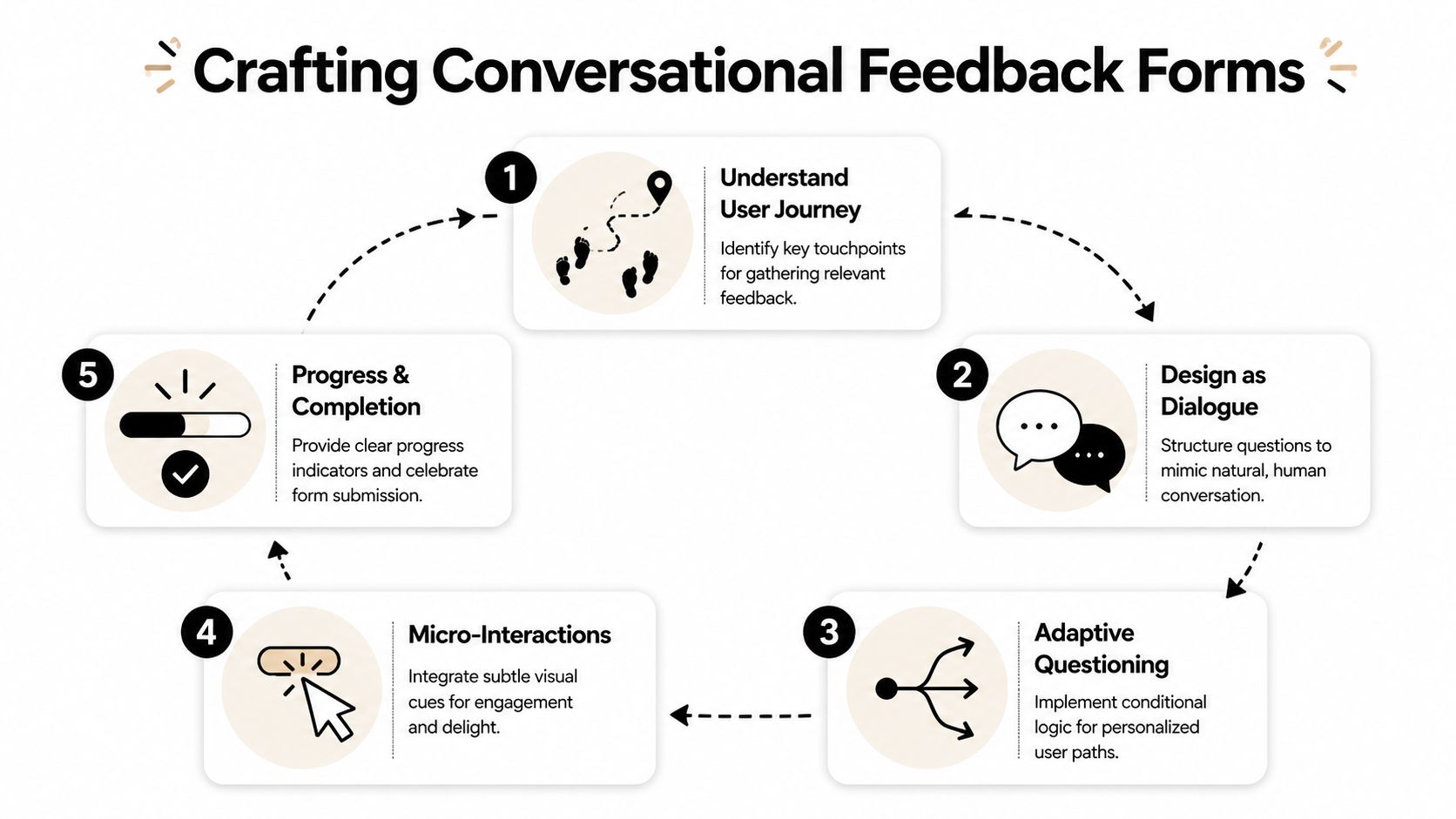
Make the form feel like a conversation
A conversational form does three things well. It reduces cognitive load, keeps the user oriented, and only asks what’s relevant.
That usually means:
- One primary question per screen so the user focuses on a single decision.
- Short helper text when the question needs context.
- Visible progress feedback so completion feels finite.
- Natural transitions such as follow-up questions that respond to the prior answer.
A lot of the same principles show up in broader UX work. Data Hunters Agency's UX guide is a solid reference if you want to tighten interaction patterns around clarity, consistency, and mobile behavior.
Here’s a quick walkthrough of the approach in action:
Map logic before you open your form builder
Branching is one of the clearest performance levers in form design. NiceReply’s feedback form checklist notes that advanced branching and conditional logic can increase form completion rates by 25-40%, and that poor logic rendering on mobile contributes to 40% of drop-offs in those cases.
The reason is simple. Irrelevant questions feel like work.
Map the flow in plain language first:
- If the user says they completed the task easily, ask what helped.
- If they say they struggled, ask where friction appeared.
- If they identify themselves as evaluating vendors, ask timeline and use case.
- If they mention a bug, ask for page, device context, and a description.
That’s enough to design a clean decision tree without overcomplicating it.
A no-code platform such as interactive form builders can handle this visually, but the tool is not the hard part. The logic is.
Ask the shortest possible follow-up that explains the previous answer.
Treat mobile as the main experience
It is common to preview forms on desktop and call it done. That’s how you end up with cramped scales, hidden buttons, and broken logic paths on phones.
Use a mobile-first checklist:
- Tap targets: answer choices should be easy to hit with a thumb.
- Short answer lists: long dropdowns are painful on small screens.
- Minimal typing: prefer taps over text unless you need detail.
- Fast load and stable transitions: especially if your form appears in-app or in a modal.
This is also where tool choice can matter. BuildForm, for example, supports conversational forms, conditional flows, partial submission tracking, and direct embeds, which makes it viable for teams that want the form itself to qualify and nurture leads instead of just collecting responses.
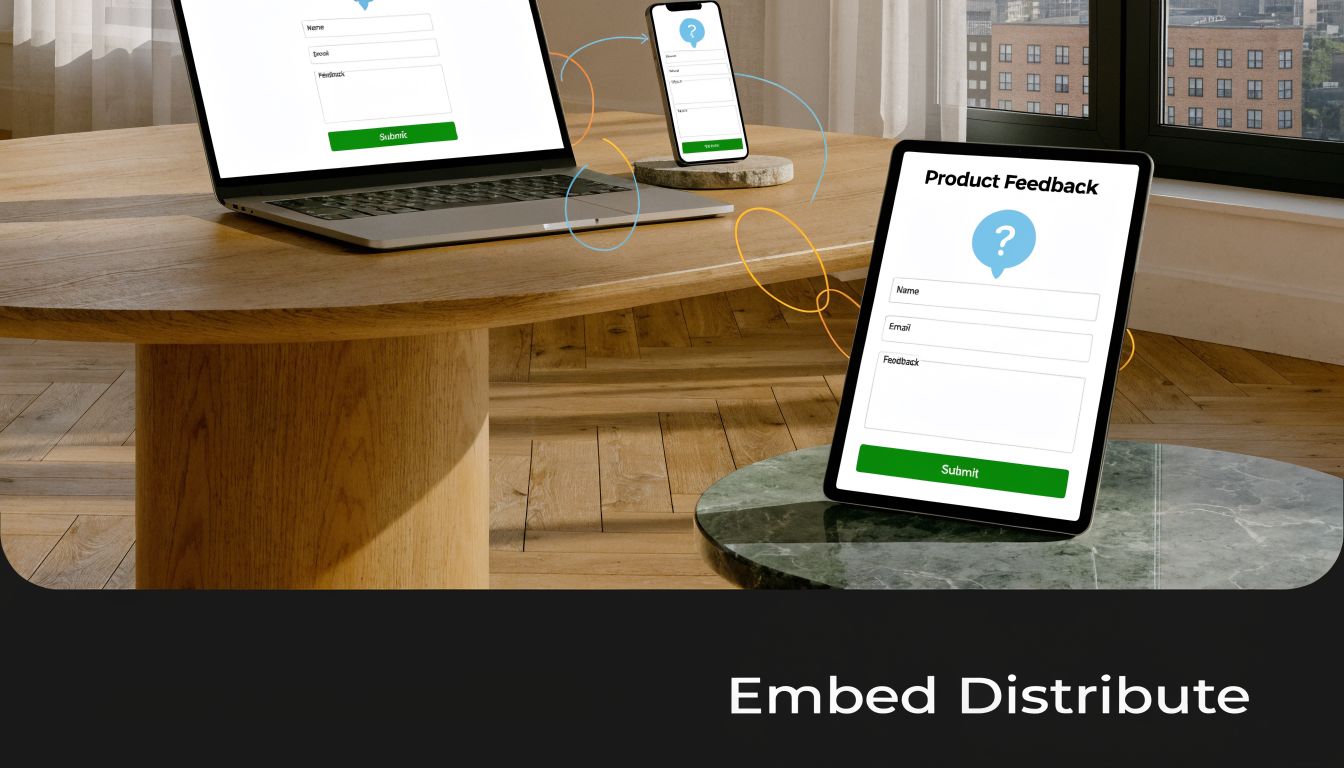
Embed Integrate and Distribute Your Form
A strong form in the wrong place won’t produce much. Distribution decides who sees the form, when they see it, and what context they’re in when they answer.
The rule is straightforward: place the form as close as possible to the moment you want explained. Post-purchase feedback belongs after the order flow. Onboarding friction belongs inside or immediately after setup. Objection capture belongs on high-intent pages where users hesitate, such as pricing, demo, or checkout.
Choose placement based on intent
Different delivery methods do different jobs.
- Embedded on page: best when the user already has context and you want minimal friction. Good for pricing pages, help centers, and post-purchase screens.
- Direct link in email: useful after support interactions, webinars, demos, or deliveries. The user can answer when they have a moment.
- Triggered modal or slide-in: works when tied to behavior, such as exit intent, repeated hesitation, or failed completion.
- In-app prompt: ideal for onboarding, feature feedback, and workflow-specific questions because you catch the user while the experience is fresh.
What doesn’t work well is showing the same generic form everywhere. A homepage visitor, a trial user, and a repeat customer should not see the same prompt.
Send feedback into the tools your team already uses
Feedback becomes useful when it enters a workflow, not when it sits in a dashboard.
Here’s what to wire up:
- Slack notifications for urgent negative responses, cancellation signals, or bug reports.
- CRM enrichment when a lead reveals budget timing, team size, use case, or implementation pain.
- Project tools like Notion, Linear, or Jira when the response points to a product issue or request.
- Email tools for follow-up sequences based on the answer path.
- Customer success systems when an account signals frustration or low confidence.
A practical example: if someone says they didn’t book a demo because integration support was unclear, the form can tag the lead, send sales a summary, and trigger a follow-up email with implementation documentation. That turns feedback into nurturing.
Another example: if a customer reports confusion during setup, route the response to product and customer success simultaneously. Product gets pattern data. Success gets a chance to intervene.
Analyze Results and Optimize for Better Data
Teams often read responses before they evaluate the form that generated them. That’s backward.
You need to know whether the form itself is working before you treat the answers as representative. If the wrong users abandon early, if mobile users fail on a branching step, or if one question consistently kills completion, your feedback set is biased before analysis even begins.

Measure the form before you trust the answers
Start with form performance metrics:
- Completion rate: are people finishing?
- Time to complete: does the experience feel heavier than intended?
- Question-level drop-off: where exactly do people leave?
- Partial submissions: what had they answered before abandoning?
Partial submission tracking is especially useful because it shows where intent existed but friction won. If respondents often quit after an open-ended question, that prompt may be too early, too vague, or too demanding. If they leave on mobile during a logic split, the experience likely needs simplification.
For teams refining attribution or post-purchase learning, survey analysis can also support channel decisions. This guide on how to improve attribution with surveys is useful for thinking about survey data as an operational input rather than a reporting afterthought.
If you want a tighter handle on these metrics, tools that focus on form analytics make it easier to inspect abandonment and iterate quickly.
Use valence to interpret what people are telling you
Not all feedback should be handled the same way. The Performance Feedback Valence Theory, introduced by the University of Illinois Chicago Business School, is useful here because it separates the effect of positive and negative feedback based on trust and delivery context. According to the UIC summary, positive feedback can enhance performance by 20-30%, while negative feedback only works reliably when trust already exists. The same source notes that anonymous options can increase response trust by 25%, which often makes feedback more honest and therefore more actionable. See the UIC overview of Performance Feedback Valence Theory.
That matters for form design in two ways.
First, don’t treat positive feedback as fluff. Positive responses often tell you what message to amplify, what feature to highlight, or what moment of value to preserve. For marketers, those answers often become ad copy, demo call talk tracks, onboarding prompts, and testimonial outreach lists.
Second, don’t overreact to blunt negative feedback without context. If trust is low or the form invites venting without structure, the response may be emotionally true but operationally incomplete. Add follow-up prompts that ask what happened, where it happened, and what the user expected instead.
Anonymous responses can reveal more honest friction. Named responses are better for follow-up. Choose based on the job the form needs to do.
Turn answers into routing and iteration rules
The best feedback loops end with changes to both the business and the form.
Use quantitative answers to spot patterns. Use open text to explain them. Then change one thing at a time:
- rewrite confusing prompts
- remove low-value questions
- split one broad form into two narrow ones
- add routing for high-intent respondents
- insert a follow-up question after low ratings
- test anonymous versus named submission where honesty matters more than direct outreach
If you’re serious about how to create feedback forms that improve conversion, don’t stop at reading comments. Build routing rules. Build follow-up sequences. Build better prompts. Then ship the next version fast.
If you want to turn feedback collection into a working part of your funnel, try BuildForm. It lets teams create conversational forms, add conditional logic without code, track partial submissions, and send responses into tools like Slack, Notion, CRMs, and email platforms so feedback can qualify leads, flag churn risk, and trigger follow-up instead of sitting in a spreadsheet.